Building a static website (part 5: Introduction to responsive images)
 30-AUG-2025, updated 18-MAY-2026
In an earlier post, I looked into subjects including physical screen sizes, logical (CSS) and physical pixels and what resolution really means. With those subjects introduced, I am in a better position to explore the techniques and design decisions around the basics of responsive images.
The subject of responsive images is a big topic, but I think it is worth at this point looking into the basics of how this should work. I must admit, I found this whole thing very confusing (and still do to a certain extent), but I think I understand enough to consider some of the design points that I will need to bear in mind. The subject of responsive images is part of the much wider subject of responsive design. That of course is an even bigger topic and I will leave that for one or more future blog posts.
To reiterate: this is not a tutorial, it is more a voyage of discovery, as I try to understand the basic concepts that underlie responsive images and I'm bringing along anyone who is reading. If I can eventually explain it to other people, then I can begin to think that I have some understanding myself.
HTML preloading and viewport width
Before exploring the idea of responsive images in more detail, I thought it was worth discussing a couple of concepts that deeply affect how we approach responsive images and why that is. I will be referring to these concepts later in the post.
When any modern browser starts to load a web page, it immediately starts by grabbing the HTML. This happens before the CSS file is loaded. Crucially, this means that at the point where the browser encounters one of our <img> elements, it does not know what size the image is going to be displayed at.
In fact, about the only thing that the browser does know at this point is the size of the browser viewport. The term viewport is essentially a fancy way of saying "width and height of the browser window". Generally, the width of the viewport tends to be the most important.

What all this amounts to is that:
- We cannot use CSS to provide the information for responsive images, that has to be included in the HTML (as we will explore below).
- Where we talk about "width", we are talking about the width of the viewport.
- The browser viewport can be represented by the CSS unit "vw", which means "viewport width". It acts like a percentage value, so "100vw" means "100% of the browser viewport width".
There are also further consequences that I may explore later, after I have covered more of the details.
What are responsive images?
I think it is clearly important to try and define what we mean by responsive images, so I will try to put forward my understanding here.
When we author webpages, and include images in those webpages, we don't have any idea of how those pages will be viewed – on what device, at what orientation, or what screen resolution somebody may use, plus a host of other properties that may change. That means that ideally, the images that we provide to the viewer should respond as far as possible to those differing circumstances.
Ignoring the overall layout of a web page for the moment, it is true that most or all of the elements that we display on a webpage can have issues arising from people viewing those elements on different devices and browsers, but images (especially bitmap images) have some particular features that can make them especially difficult to deal with. I briefly explored some of those in the previous post, but this includes:
- Image file sizes can be relatively large (in comparison with things like the text on the page), so serving large images to small devices may not be desirable.
- Bitmap images have an intrinsic size, which increases the difficulty of fitting them into varying areas of a webpage.
- The actual visual content of an image can cause difficulties in situations where we have to drastically resize that image (such as a landscape image on a portrait screen).
Taking into account the above, it seems to me that there are four categories of problems we are trying to solve, which involve differing but related techniques. Note that the first two are particularly closely related, but I do see them as being distinct:
- Allow the browser to resize one single image as necessary.
- Serve the same image to the user but at different viewport sizes.
- Serve different images to the user at the same physical size but at differing resolutions.
- Serve a different image, in terms of visual content to the user, depending on the circumstances (commonly known as the art direction problem).
I will take take these in order in an attempt to understand them and how we deal with them.
Resize a single image as necessary
I have already briefly looked at this. This is just a matter of taking one image file and then using CSS to get the browser to resize that image as necessary. This means that we can have a large image and have the browser reduce it in size when, say the viewport is reduced in size such that it is then smaller than the horizontal pixel value of that image. We saw that in the earlier blog post, using the following CSS:
img
{
   max-inline-size: 100%;
   block-size: auto;
}
This of course can be applied the other way round – if we have a small image, we can get the browser to resize it upwards to fill the space we want. To demonstrate this, alongside also showing how this can be a bad idea, consider the following two images. Note that the blue border is not part of the images, instead it has been added through CSS to indicate the outer edges of the images.
Both of these images are defined as being 200 x 100 pixels and as displayed at their intrinsic size, they look pretty much identical. However, the first image is an SVG file and the second one is a WebP image, exported from the SVG.
If you click on either of the images, it will take you to a separate page that if you are in a position to resize the browser window, will cause the browser to change the size of the image displayed to fit into the window, until it becomes wider than 1200 pixels. The relevant CSS is:
img.resize
{
   inline-size: 100%;
   max-inline-size: 1200px;
}
Note that my understanding is that "inline-size" and "max-inline-size" are CSS logical properties equivalent to "width" and "max-width".


For me, this demonstrate a couple of things:
- In principle, responsive images in this sense is actually very straightforward – you just choose your image file and then get the browser to do the hard work of resizing it, depending on the circumstances.
- SVG images are clearly much better than the bitmap images in this scenario if they can be used. They can be scaled to almost any size without loss of quality, in a major contrast to their bitmap image equivalent.
However, there are some clear disadvantages:
- There are a lot of occasions when an SVG images simply not suitable — displaying a nice photograph for example.
- If you are forced to use a bitmap image, a small image will look terrible scaled up, but a large image will take up a significant amount of bandwidth, because the file size starts to be quite significant, even with good compression, especially on a metered connection such as a smartphone.
What this means is that this approach is frequently not tenable. Having said that, I will be trying to use SVG images throughout many of the remaining blog posts, as many of these will just be for demonstration purposes.
Serve different images at varying widths
In the previous section, I looked into how at the most basic level, you can provide responsive images by simply getting the browser to resize one image file, by in that case, using CSS to force the image to be scaled up and down, depending on the width of the browser window. Unfortunately, there are also good reasons why that is not a good solution unless you are able to use something like SVG images, which are small in size and can be resized without quality loss.
In this section, I wanted to understand how you can get round some of the limitations, by serving up a different image, depending on the circumstances, as defined by a combination of HTML and media conditions (similar to media queries but with some limitations). Essentially, you can have one or more images of different pixel dimensions and by specifying some information about those images to the browser, you can allow it to choose the most suitable one.
The advantage of this for the user is that it should minimise the amount of data that needs to be transferred, based on a number of different things, including the device being used, network speed, the size of the screen or viewport area and so on. For example, if somebody is using a smart phone that is only 400 pixels wide, it likely makes more sense to display an image close to that size than another image file that is 1200 pixels wide, assuming the smaller image is available.
As usual, rather than attempting any kind of detailed tutorial, of which there are many out there, I just wanted to dive straight into the example demo that I pieced together from my reading of the subject, so I could check my understanding of how it works, at least with a reasonably straightforward case.
As it would potentially be quite difficult to tell which one of a set of images was actually being displayed under normal circumstances, in the demo image, I have clearly marked the pixel width of the image in red. If you have a browser window that you can resize, you should most likely be able to see that every so often, the image will change, which is exactly what we want.
Note that, depending on your browser, you may find that you have to reload the page after resizing the browser window. I found that was the case sometimes with a browser such as Opera, although sometimes you wouldn't have to when you made the browser window bigger again. Firefox (on Linux at least) doesn't seem to require that – it detects the resizing and changes immediately.
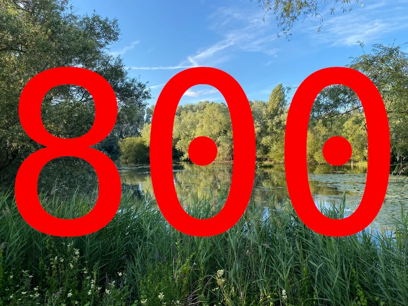
Note that the CSS being used with this image display is as follows:
img
{
   max-inline-size: 100%;
}
This just means that the browser will attempt to resize the image to 100% of the browser window, but will stop doing so when it reaches 1200 pixels wide (the intrinsic width of the image).
The actual magic is in the HTML:
<img srcset="
     images/lake_and_trees-land-0200w.webp 200w,
     images/lake_and_trees-land-0400w.webp 400w,
     images/lake_and_trees-land-0800w.webp 800w,
     images/lake_and_trees-land-1000w.webp 1000w,
     images/lake_and_trees-land-1200w.webp 1200w"
sizes="(max-width: 1200px) 100vw, 1200px"
src="images/lake_and_trees-land-0800w.webp"
alt="Lake and trees.">
Put simply, the "srcset" attribute specifies a comma separated list of images, along with their actual pixel width (as opposed to CSS or logical pixels). For example "400w" means that the image is 400 pixels wide. This gives the browser the size information that it needs about the available images as soon as it parses the HTML.
Meanwhile, the "sizes" attribute specifies a number of media conditions that provide hints to the browser on which image should be used. In this case, it is a very straightforward example. The "(max-width: 1200px) 100vw, 1200px" is saying that up to and including where the viewport width is 1200px, we expect the image to span 100% of the viewport width, otherwise the image will be displayed at a maximum of 1200px.
The list of available images specified by srcset then gives the browser alternatives to use, which it can display, depending on factors such as the current width of the viewport, although in theory it can take into account many other factors. As you may already have seen, you can see this in action when you resize the browser window (assuming that's possible on your device).
It is worth noting that the image widths specified do not need to exactly match, because the browser can choose to resize something that is close to the right value and in any case, the sizes are only hints to the browser.
My understanding is that the media conditions can use other CSS units besides pixels (any length value I believe), but I'm not going to worry about that, because right now I just need to have a basic understanding of the concept.
On my setup (with a 2560x1440 monitor running Firefox), resizing the browser window displayed everything from a minimum of the 400 pixel wide image all the way to the 1200 pixel wide image.
On a 4K monitor, the images that are displayed depend on the browser. With Firefox, I only saw a minimum of 1000 pixels wide, or the full 1200 pixel wide image, but with Seamonkey, things are little different. Also note that Seamonkey browser window can be resize to be narrower than Firefox one. I haven't checked other browsers, so that may vary of course. It also seems to be the case that this approach can allow the browser to factor in different screen resolutions when choosing an image size.
Naturally, things can get an awful lot more complicated, especially when you get to the point of considering how this all ties in with the wider subject of responsive design. I intended to return to this subject in much more detail in later blog posts.
Consequences of this approach to responsive images
I think it is worth pointing out that there are some significant consequences to this approach to responsive images.
The one that really stands out is that we are including information about how something should be displayed within the HTML. On the face of it, this is something that runs counter to the direction that things have moved in, where we attempt to use CSS to separate content from how it is actually displayed.
As far as I can see, the real consequence of this is that if you were to change the design of your website in a way that would affect the display of images, you might have to go back and revisit the HTML of every single web page that you have written already. Unfortunately, as I covered earlier, this is required because browser performance is enormously enhanced by reading the HTML before CSS. It is certainly something I am going to have to think about.
Serve different images at different resolutions
Before continuing, it might be worth bearing in mind the concepts I discussed in my earlier post "Building a static website (part 3: Screen sizes, logical and physical pixels, resolution and scaling factor).
This case is similar to the one presented previously, in that we try to present the user with different image files, dependent on whether a particular condition is met. The big difference is that we are interested in presenting different images on change of resolution, as opposed to size.
As a reminder of how this works if we just display an image using the normal straightforward HTML, take a look at the image of the famous Blackpool Tower below. This image is 800 pixels wide and to make that more obvious, I have marked the image with not only that size, but the designation "1x", the importance of which will become apparent a bit later.
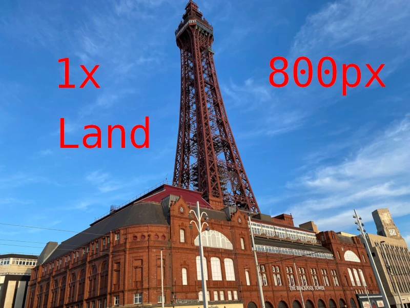
If you happen to view this image on a monitor that has a DPR (Device Pixel Ratio) of 1.0 or thereabouts, each pixel of the image will be displayed by one physical pixel of the monitor.
If you are then in a position to look at the same image displayed on a monitor with a DPR of approximately 2.0, such as a 4K monitor, it will display exactly the same image at roughly the same physical size, assuming that screen is about the same size as the screen with a DPR of 1.0, because as I had explained in an earlier blog post, the scale factor means that each pixel of the image uses to pixels horizontally and vertically on the physical monitor screen.
So now we come to the point of the exercise. Some of the people viewing your webpage might be doing so on a 4K/HiDPI monitor, so wouldn't it be great if you could serve a bigger sized photo of the same content, so they could take advantage of their higher resolution screen? As I understand it, the solution to this specific problem is to use some HTML that uses the "srcset" attribute to list two or more images, but in this case, instead of using the "sizes" attribute, each image is associated with a resolution value.
Using the same Blackpool Tower image, we can use the following HTML to serve three possible images, or at least hint to the browser that it might wish to use one of those different images, depending on the resolution of the screen we are using to view the image.
<p>
   <img
   srcset="images/blackpool_tower-land-0800w.webp 1x,
           images/blackpool_tower-land-1200w.webp 1.5x,
           images/blackpool_tower-land-1600w.webp 2x"
   src="images/blackpool_tower-land-0800w.webp" alt="Blackpool Tower.">
</p>
The 800 pixel wide image is considered the standard or "1x" image, while a 1200 pixel wide image is considered "1.5x" and finally, for those even higher resolution screens, the 1600 pixel wide image is designated as "2x". There is also the usual fallback image, which in this case is the same 800 pixel wide image. Hopefully, it should be clear how this works.
Now, if you are able to view or are viewing the image below on a high-resolution screen, such as a 4K monitor, it will display a different image, quite possibly the 1600 pixel wide image, which is of course twice the resolution of the one that you would display on the standard resolution monitor. This is certainly what I see when I test this out, but if you don't have such a screen, then you will just have to take my word for it. 😀
Whether all this is worthwhile may well depend on how good your eyesight is and/or how big the screen you have is. Personally, I'm not sure I can tell the difference! Not all browsers will necessarily work with this, but most should do.
In addition, it's worth noting that this is probably an approach that will be relatively unusual, because most of the time it is likely that you will want to serve different sized images as you display on a different sized viewport or the user changes the size of the browser window (the previous case I covered). Also, the HTML that deals with serving different images of varying widths also seems to be able to deal with this kind of case, as I commented on in the previous section.
Art direction
Instead of the previous cases, where we are showing a user different sizes or resolutions of the same image content, there is the final technique that allows the designer to show differing image content, based on different scenarios. The image below shows a classic case of what this can mean. Once again, we have an image of Blackpool Tower, but in this instance, as you change the width of the browser window, it switches between landscape and portrait version of the photos. I understand that this kind of thing is called "art direction".
The technique relies on the <picture> HTML element, along with the use of one or more <source> elements, which provide the list of images and media conditions that control the behaviour.
For the specific case of the above Blackpool Tower image, the HTML looks as follows:
<picture>
  <source media="(width >= 800px)" srcset="images/blackpool_tower-land-0800w.webp">
  <source media="(width < 800px)" srcset="images/blackpool_tower-port-0600w.webp">
  <img src="images/blackpool_tower-land-0800w.webp" alt="Blackpool Tower">
</picture>
In summary, the browser knows to switch between the two images, depending on whether the width is less than or greater than 800 pixels. I believe that this kind of thing might commonly be used to provide a different image that is more suited for a smart phone held in portrait mode for example.
As mentioned in tutorials such as HTML Responsive Images Guide, there are actually a load of different scenarios this could be used for and this can include many things beyond the basic art direction case shown above. This could include situations as diverse as:
- Allow the use of very new image formats, by specifying fallbacks to browsers that don't yet support them.
- Sending a monochrome image to a printed version of the webpage.
Apart from anything else, there are a couple of things that are important to bear in mind:
- One of the big differences between using this technique and those described earlier is that when you define the media conditions that control the images, the browser takes these as instructions, rather than hints. If a particular media condition is met, then the browser will definitely display the image at that point (assuming there isn't a problem such as a format not supported).
- The syntax allows the use of "srcset" and "sizes" attributes, which means you can combine the flexibility allowed by the <picture> element with the techniques mentioned earlier, where we can switch images based on resolution and size.
These are important, because I gather that if you really need the level of flexibility, you don't necessarily have to throw away the ability to also support the earlier responsive image techniques we talked about.
To illustrate this, the following image again uses the Blackpool Tower, but this time includes HTML that should display a higher resolution version of both the landscape and portrait image, assuming of course that it is displayed on such a screen.
The HTML is a bit more complicated, but should be familiar from earlier on:
<picture>
  <source media="(width >= 800px)"
          srcset="images/blackpool_tower-land-0800w.webp 1x,
          images/blackpool_tower-land-1600w.webp 2x">
  <source media="(width < 800px)"
          srcset="images/blackpool_tower-port-0600w.webp 1x,
          images/blackpool_tower-port-1200w.webp 2x">
  <img src="images/blackpool_tower-land-0800w.webp" alt="Blackpool Tower">
</picture>
Conclusions and design decisions
As the entire point of these blog posts is to examine the various things that I need to understand in order to be able to push forward the design of this static website I'm building, I think it would be worth discussing that now.
- The ability to serve different images at different viewport sizes is definitely something which I will be using for the display of bitmap images, because that's a very important method for reducing data requirements, especially for mobile devices.
- Serving different images at different resolutions seems less likely to be useful, as it doesn't seem to offer the level of flexibility that the other techniques can provide.
- I'm not yet sure about how useful using <picture> for art direction and other uses will be for me. I will have to consider this on a case-by-case basis, because I obviously haven't completed my webpage design by any means. Note I'm unlikely to use this extensively for supporting fallbacks to new image formats, because I'm tending to deliberately target fairly up-to-date browsers, particularly as this is not any kind of commercial site, although I could revisit that decision at some point in the future if necessary.
- It is fairly clear that all three are sometimes complex HTML that is required to support responsive images is not something that can be reasonably written by hand, so my expectation is that, once I understand exactly what my design requires, I will be generating the HTML required by using scripts. That's likely to be one or more future blog posts!
- While I continue to move forward with the website design, I will be trying to use SVG images where possible to illustrate my blog posts and that will allow me to return to the subject of responsive images later on.
That is it for now. As always, look out for the next blog post in the series.